serhii.net
In the middle of the desert you can say anything you want
-
Day 1984 (07 Jun 2024)
Screenshots in qtile with maim
maimis supposed to be the “better scrot”1# screenshot and put into clipboard maim -s | xclip -selection clipboard -t image/png -iIn qtile you can’t do that, because
|is a shell construct2.Solution: do it in a shell:
CommandSet(commands={
	#...
	"S/clipboard": "bash -c \"maim -s | xclip -selection clipboard -t image/png -i\"",
DDG feeling lucky custom search engine in qutebrowser
Added ddg’s backslash-feeling-lucky to qb search engines. Encoded the backslash as URI, it worked!
https://duckduckgo.com/?q=%5C{}Full list:
c.url.searchengines = {
        'DEFAULT': 'https://search.brave.com/search?q={}',
        'b': 'https://search.brave.com/search?q={}',
        'g': 'https://google.com/search?q={}',
        's': 'https://scholar.google.de/scholar?hl=de&as_sdt=0%2C5&q={}&btnG=',
        'ddg': 'https://duckduckgo.com/?q={}',
        'l': 'https://duckduckgo.com/?q=%5C{}',
        'c': 'http://dict.cc/?s={}',
        'y': 'https://youtube.com/results?search_query={}',
        'd': 'https://en.wiktionary.org/wiki/Special:Search?search={}',
        'w': 'https://en.wikipedia.org/wiki/Special:Search?search={}',
        'wa': 'http://wolframalpha.com/input?i={}',
}
-
Day 1983 (06 Jun 2024)
Most minimal CSL citation style
A minimal citation style(for grant proposals) – anton.cromba.ch
-
Day 1982 (05 Jun 2024)
Quarto multilingual website options
-
Quarto – Document Language is related but different.
-
R package for this, but R: ropensci-review-tools/babelquarto: Renders a Multilingual Quarto Project (Book or Website)
-
Mario Angst - A multi-language (German/ English) Quarto website
- Profiles + visible-when — all langs in one file, looks kinda ugly but why not…
- Quarto – Project Profiles
-
oooo12 - Multi-language Blog with Quarto - Guide profiles as well.
-
Approach for now — write them in separate files, and optionally at some point include them in the visible-when option?..
Quarto website creation notes
quarto create projectListing pages
- Quarto – Document Listings
- Dates are awkward: Quarto – Quarto Dates and Date Formatting
--- title: "Blog" listing: - id: test-l1 contents: "blog_posts/*" sort: "date desc" type: table categories: true - id: test-l2 contents: "blog_posts/*" sort: "date desc" type: default categories: true - id: test-l3 contents: "blog_posts/*" sort: "date desc" type: grid categories: true --- This will be a test listing page. ## Table listing ::: {#test-l1} ::: ## Default listing ::: {#test-l2} ::: ## Grid listing ::: {#test-l3} :::- Configs
- each directory can have it’s own
_metadata.ymlwith configs that will be applied to all files in that directory
- each directory can have it’s own
Publications
To get something like Drew Dimmery - Research or our old wowchemy thingy some magic will be needed.
Doing
---
title: "Publications and Awards"
bibliography: "./publications/papers.bib"
nocite: |
  @*
---
results in a list in a certain CSL format, which is limited — no ways to link videos/slides/… etc.
So likely it’ll be yet another listings view, or how Drew Dimmery - Quarto for an Academic Website did it — papers to YAML with ALL the metadata, then python script (inside quarto qmds, first nice case I see for this!) to convert it into the on-screen form.
And if code — then maybe it’s a conveter package from wowchemy yaml thingy?
- Quarto – Custom Listings together with “listing from yaml” may help?..
- Supporting category like feature for listing authors (e.g. filter by author like categories) · Issue #6246 · quarto-dev/quarto-cli TL;DR complex tags work
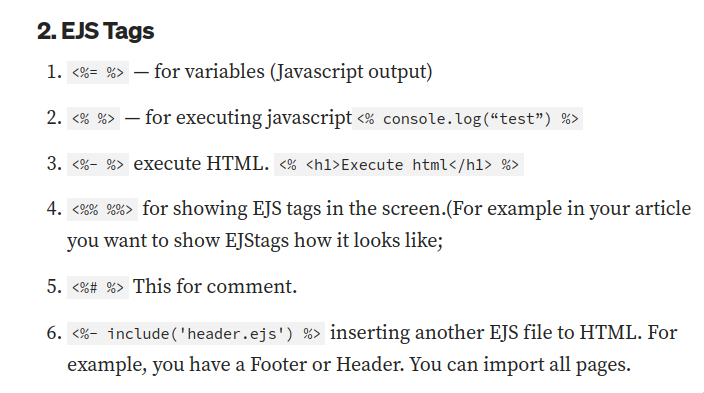
- EJS – Embedded JavaScript templates is used for templating — looks kinda similar to Hugo
- Meghan Hall describes this and links to Quarto’s own listing templates: quarto-cli/src/resources/projects/website/listing/listing-table.ejs.md at main · quarto-dev/quarto-cli
- (Quarto – Article Templates for the general thing)
OK, then:
- Concatenate all wowchemy publication files into one large yaml (one-time python thing?)
- do EJS template for it
(Alternatively — just use the dirs as-is and do no yaml)
Onwards
-
Albert Rapp - The ultimate guide to starting a Quarto blog
- cool tutorial about the basics, including:
- many ways to use listings to create blogs, archive pages, etc. + per-directory options
- layouts to create cool pages e.g. contacts
- include-after-body footers
- styling, incl. scss rules
- page-layouts and complex reactive grids
- cool tutorial about the basics, including:
-
Quarto – Article Layout is my friend — columns, margins, overflows etc.
-
Code/Other links text can be changed here: quarto-cli/src/resources/language/_language.yml at main · quarto-dev/quarto-cli
-
Quarto glob syntax can do a lot: Quarto – Quarto Glob Syntax
-
cool pic sources:
-
sample of including a style in the qmd: quarto-web/docs/gallery/index.qmd at main · quarto-dev/quarto-web
Creating a publications view
-
This convets bibtex into directory+md: GetRD/academic-file-converter: 📚 Import Bibtex publications and Jupyter Notebook blog posts into your Markdown website or book. 将Bibtex转换为Markdown网站
-
Hugo Blox template? hugo-blox-builder/modules/blox-bootstrap/layouts/publication/single.html at main · HugoBlox/hugo-blox-builder
-
Gallery example: https://github.com/quarto-dev/quarto-web/blob/main/docs/gallery/gallery.ejs
- Ex. includes using quarto syntax w/
:::in a template: quarto-web/ejs/links.ejs at main · quarto-dev/quarto-web
- Ex. includes using quarto syntax w/
-
Would be cool to have the format consistent with the existing quarto infra: quarto-web/docs/journals/authors.qmd at main · quarto-dev/quarto-web
-
EJS
<% for (let i = 0; i < item['authors'].length; i++) { %> <%= item['authors'][i] %>, <% } %>- Problem: full HTML templates don’t accept markdown bits: Markdown not parsed in listings with custom EJS · Issue #8756 · quarto-dev/quarto-cli
Changes in the paper mds
- Remove markdown from all existing paper md, HTML-only
- Remove “image” key
dateis publishing date of the paper, not of its page —publishDatedoesn’t exist- publicationType: maybe at some point change the int representation into str, as per latest hugo blocks behaviour
- doi: no URI
- publication: no
In *journal*, justjournal
This and only this will be supported:
title: 'Title' authors: - TODO - TODO date: '2010-10-20T00:00:00Z' doi: # Publication name and optional abbreviated publication name. publication: 'Proceedings of the World Congress on Engineering and Computer Science. Vol. 1' publication_short: 'WCeCS 2010' abstract: 'Long abstract' links: - name: TODO Anthology url: https://aclanthology.org/L14-1240 url_pdf: slides: video: tags: - paper-tagEDIT: more fields here: hugo-blox-builder/modules/blox-bootstrap/archetypes/publication/index.md at main · HugoBlox/hugo-blox-builder
url_pdf:
url_code:
url_dataset:
url_poster:
url_source:
url_project:
url_slides:
url_video:
Process
Parsing date year
Datetime formatting / customization in ejs - Stack Overflow describes ways to do things with dates in EJS/JS
<%= new Date().getFullYear();%>OK so I can use JS?
// Works
<%= new Date(item.date).getFullYear() %>
Iconify Icons
I can’t seem to use shortcodes inside html EJS (same as markdown problem I guess?)
But I can use the CSS (and ofc just download the PNG files)
Accessing file path to find its Bibtex
.. in a file inside same dir as paper markdown.
-
Problem: no access to filename being rendered!
-
item.filenameis the name, not path. I can’t do “link to file in the same directory as the one being listed” -
Find the name of the current file being rendered in Quarto - General - Posit Community
-
At some point you could use shortcodes in frontmatter: Variables in categories (in frontmatter) do not parse properly when
categoriesis set to true in listing · Issue #5578 · quarto-dev/quarto-cli- metadata is the one in the listing page, not the page being listed :(
-
[FR] New Lua utility function to access qmd input filename · Issue #2249 · quarto-dev/quarto-cli
- mcanouil/quarto-lua-env: lua-env is an extension for Quarto to provide access to LUA objects as metadata.
- extension to get access to some vars
- works for not-frontmatter
-
Just realized that for listings
item.path(=location of page) is just what I need — I just need to change the last element- Split Path String - DEV Community for js path operations
Most horrible thing I’ve ever written but seems to work:
<%= item.path %><br>
<% let x= item.path.split('/') %>
<% x.pop() %>
<%- x.join('/') %>
<%- x.join('/') %>/cite.bib

// ---

<% let x= item.path.split('/'); x.pop(); let biburi =  x.join('/')+'/cite.bib' %>
<a href="<%- biburi %>">
	<%= biburi %>
</a>
(I should just do a lua filter or something at this point)
Anchors
Idea: link from elsewhere directly to the paper in papers
- Text fragments
- not supported in firefox
- could write a trivial style and use quarto’s mechanisms for citations but that doesn’t matter because not widely supported
- anchors
- markdown - How to link to a named anchor in Multimarkdown? - Stack Overflow
- completed with anchors, taken from dirname and optionally overwritten by a paper’s front-matter
Final system: described in 240618-1448 Quarto publications page and adding anchors
And back to exporting obsidian to hugo
Obyde needs 3.8 and fails otherwise, new OS maybe time for new ways to convert. There are many actually. Some active mantained and expandable.
For later:
- devidw/obsidian-to-hugo: Process Obsidian notes to publish them with Hugo. Supports transformation of Obsidian wiki links into Hugo shortcodes for internal linking. looks especially nice.
- Publishing Obsidian vault with Hugo - Sagar Behere lists all the other ways and is really detailed
- (Also on hugo A Hugo Survival Guide is a neat thing I’ll read sometime)
So
obsidian-to-hugo doesn’t support assets/images :( Leaving only ukautz/obsidian-meets-hugo: Command line tool to export Obsidian Vault into Hugo published website for me.
- preserves Obsidian directory structure — nice
- not recursive by default
- doesn’t create
_index.mdfiles, and converts existing ones in Obsidian to-index.md- pchr8/obsidian-meets-hugo: Command line tool to export Obsidian Vault into Hugo published website forked and did my first go programming to fix this
- doesn’t support folders, but one can filter by tags — good that I used both since the beginning!
- for multiple tags a “list” is possible — and apparently that’s
-i tag1 -i tag2 -i tag31
- for multiple tags a “list” is possible — and apparently that’s
Current CLI:
go run cmds/omh/main.go --obsidian-root=../public_obs/ -R --hugo-root=../dtb/ --sub-path= -i=uni -i=zc/it -i=zc/rlOnwards
- 3 refs not found
- I don’t understand why hugo says “ref … page not found” - support - HUGO:
Is linksphoto.md unpublished (draft, expired, or future)? Or, to put it another way, what happens when you run
hugo server -DEF? fixed for me! hardcoded hugo-format refs in obsidian broke because now different names — converted to real obsidian links and this fixed the remaining ones
- I don’t understand why hugo says “ref … page not found” - support - HUGO:
- cyrillic names now unsupported?
- 220407-2246 Чебуреки etc.
- damn.
- It’s the same
var insane = regexp.MustCompile(`[^a-zA-Z0-9\-]`) func Sanitize(in string) string { return insane.ReplaceAllString(in, "") } - w/ chatGPT, changed regex to
[^a-zA-Z0-9\-\p{Cyrillic}]— now it does upper+lowercase cyrillics — so now it’s220407-2246-Чебуреки.mdin the md filename, but the URI has it lowercased. - Relevant:
disablePathToLowerin config2 — not changing because cool URIs don’t change and this was the default for years on this website
- Images are broken
- …
//assetsalrighty… - Docu: Static files | Hugo
-
By default, the static/ directory in the site project is used for all static files (e.g. stylesheets, JavaScript, images). The static files are served on the site root path (eg. if you have the file static/image.png you can access it using http://{server-url}/image.png, to include it in a document you can use !
[Example image](/image.png)). - you can have multiple such directories
-
- Ah — maybe it’ll work when uploaded to my website, where
/xxxwill refer to the website and not my local install - If I manually fix
//assets/..to/assets(one slash) then it shows up nicely locally - In
omh.gothis happens:return fmt.Sprintf("[%s](/%s/%s)", title, c.SubPath, target) - AH it’s because of my empty subpath directory argument — if I pass something then everything works. Oh GodDAMN it.
- OK this fixes it. And I hope creates no more problems.
if c.SubPath == "" {
    return fmt.Sprintf("[%s](%s/%s)", title, c.SubPath, target)
  } else {
return fmt.Sprintf("[%s](/%s/%s)", title, c.SubPath, target)
- Debugging a notes called
_indexI realize that it takes Hugo frontmatter title from note title, which in turn is the filename, NOT the obsidian file frontmatter title :(- problem because my layouts rely on a magic constant in some directories…
- I hope it’s my last fix.
  // Keep title in Obsidian front-matter as note title if it's there (a la obyde),
  // otherwise use Obsidian filename for this (standard behaviour).
  oldTitle := hugo["title"]
  if oldTitle==nil {
    log.Warn("No title in front-matter, using filename in ", note.Title)
    // must have title
    hugo["title"] = note.Title
  } else {
    log.Warn("Using frontmatter title for ", oldTitle)
  }
-
had to figure this syntax out based on other github issues: StringSlice behavior different for command line flag and environment variable · Issue #380 · spf13/viper ↩︎
-
-
Day 1981 (04 Jun 2024)
New Linux install notes
Wanted to do Manjaro, after googling found out it has a very bad reputation (arindas/manjarno: Reasons for which I don’t use Manjaro anymore) — I’ll go with EndeavourOS. OpenSUSE Tumbleweed will be my next choice if this fails.
Strategy:
/optwill have executable programs- TG, hugo(?), pycharm, kitty?..
- qtile, qutebrowser
- home encrypted, but separate swap+etc. partitions of size of ram
- or not, since encrypted home/swap/… and hibernation are hard — so only encryption
- FS: BTRFS
- …because snappshotting for if one randomly
rms/etc12.- SysadminGuide - btrfs Wiki
- I like this: Btrfs - Manjaro
- Reasons against exist3.
- df will incorrectly report space usage
- no native encryption support
- complexity
- F2FS is the fastest for SSDs but can lose data if battery dies
- …because snappshotting for if one randomly
- Dotfiles
- radically simplify everything, no need to source global ones and /home/me etc. — I’ll just use the same user for everything
OK, EndeavourOS+btfrs it is.
- Post-install steps
-
Why should I switch my file system to btrfs? : r/archlinux ↩︎
-
TIL BTRFS is neat for smaller filesystems! ↩︎
-
Day 1959 (13 May 2024)
NII files
https://www.kaggle.com/code/datark1/what-are-dcm-and-nii-files-and-how-to-read-them
-
NII files are typical for MRI data
-
This library can open them: https://nipy.org/nibabel/gettingstarted.html
-
Read and write access to common neuroimaging file formats, including: ANALYZE (plain, SPM99, SPM2 and later), GIFTI, NIfTI1, NIfTI2, CIFTI-2, MINC1, MINC2, AFNI BRIK/HEAD, ECAT and Philips PAR/REC. In addition, NiBabel also supports FreeSurfer’s MGH, geometry, annotation and morphometry files, and provides some limited support for DICOM.
-
-
Cool viewers exist
- online
- https://socr.umich.edu/HTML5/BrainViewer/
- for annotated files, 3d opacity+threshold help seeing the annotated areas VS raw image
- drop multiple files (e.g. raw + ground truth) to have them as multiple layers
- https://brainbrowser.cbrain.mcgill.ca/volume-viewer
- can do 4d (3d+time) viewing! E.g. beating heart from ACDC dataset
- https://www.fmrib.ox.ac.uk/ukbiobank/group_means/index.html may or may not be papaya
- https://niivue.github.io/niivue-ui/ neat w/ probe1.nii.gz
- https://viewer.imaging.datacommons.cancer.gov/viewer/1.3.6.1.4.1.14519.5.2.1.6279.6001.224985459390356936417021464571?seriesInstanceUID=1.2.276.0.7230010.3.1.3.0.57823.1553343864.578877,1.3.6.1.4.1.14519.5.2.1.6279.6001.273525289046256012743471155680 a cool viewerKKJJjjkk
- https://socr.umich.edu/HTML5/BrainViewer/
- online
-
list of others: https://docs.facebase.org/docs/nifti-files/
-
https://github.com/niivue/niivue even better list of others
-
Other
- Maternal Brain Project - OpenNeuro OpenNeuro has many datasets
Inkscape bullet points
- Not supported out of the box:
- https://alpha.inkscape.org/vectors/www.inkscapeforum.com/viewtopic0f39.html?t=9647:
-
I usually clone a circle and distribute it evenly next to the text object
<C-u-2022>adds a bullet point symbol
-
-
-
Day 1951 (05 May 2024)
Hack for quarto roughnotation and speaker view
Quarto’s roughnotation works either in speaker view or in the presentation, separately from each other.
Very brittle, but:
- jitsi share my presentation window, “show me what I’m sharing” and then right click picture-in-picture
- drag that picture over the presentation in speaker view :)
.. yeah.